Vector Watch
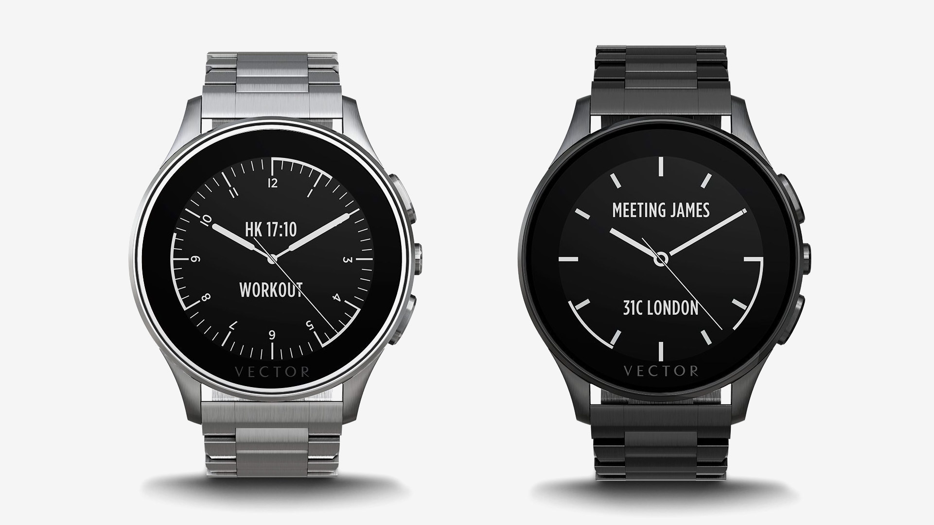
We partnered with Vector in order to define and implement an intuitive user experience for their innovative watch.
The watch features an e-ink LCD screen, a 30 day battery life, a smartphone control app as well as its own operating system and open developer API that allows them to create their own apps and faces.
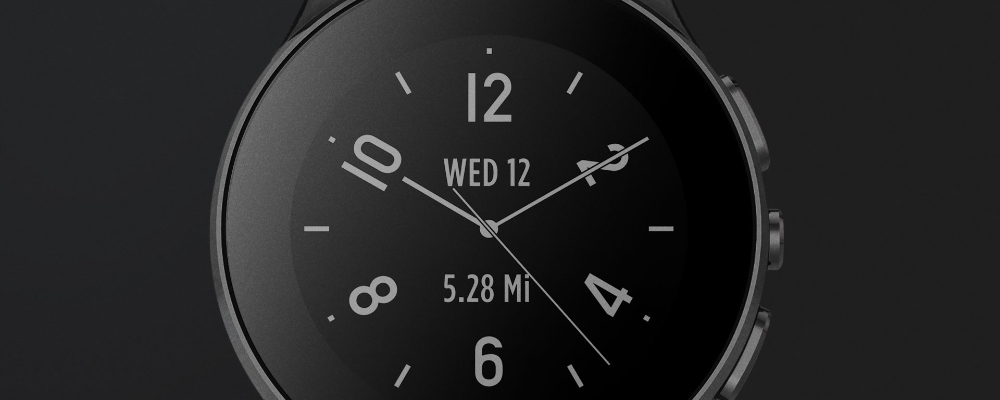
With a combination of iconic design and essential technology, Vector watches entered the aggressive wearables market with a very ambitious proposition, to keep you connected with your business, family and friends with a 30-day battery life on a single charge.
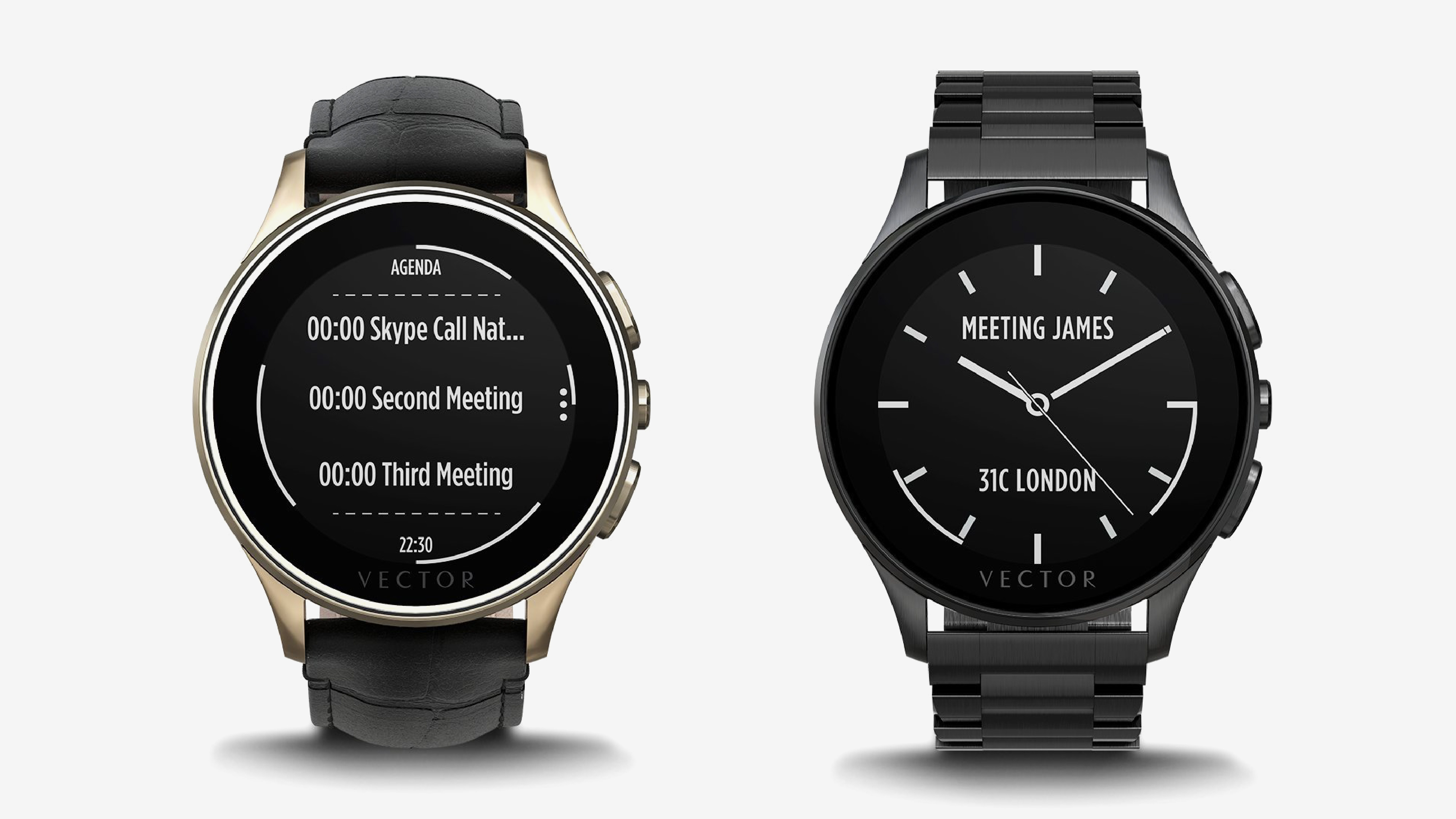
The key to a successful complex device is to make it feel simple. Our team translated Vector’s complex technology and features into a streamlined product experience to meet the brand’s vision of simplicity and subtle luxury. Minding that the watch doesn’t have a touch screen, our challenge was to figure out the best user experience on a monochrome digital dial with physical crown and push buttons.
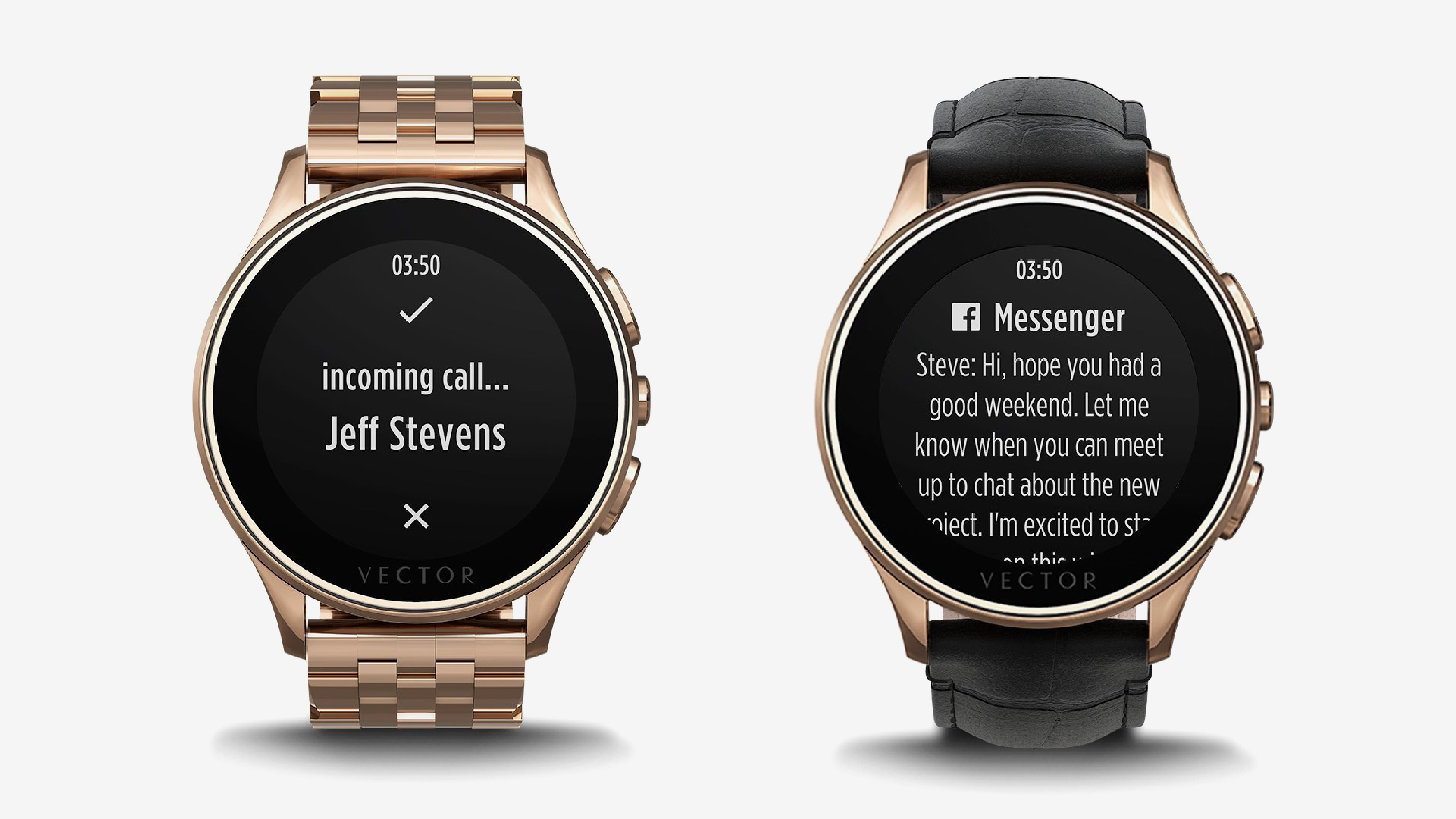
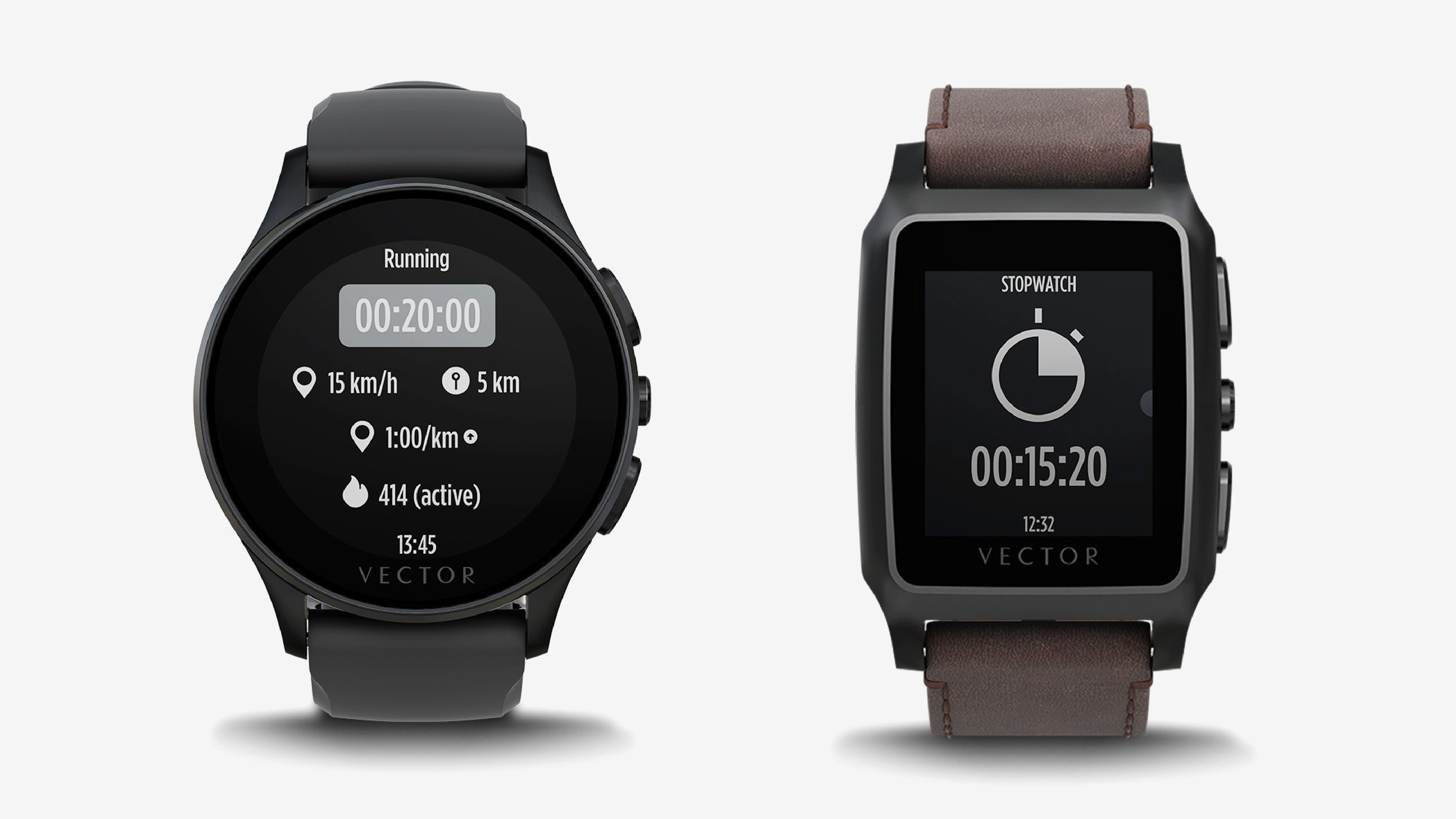
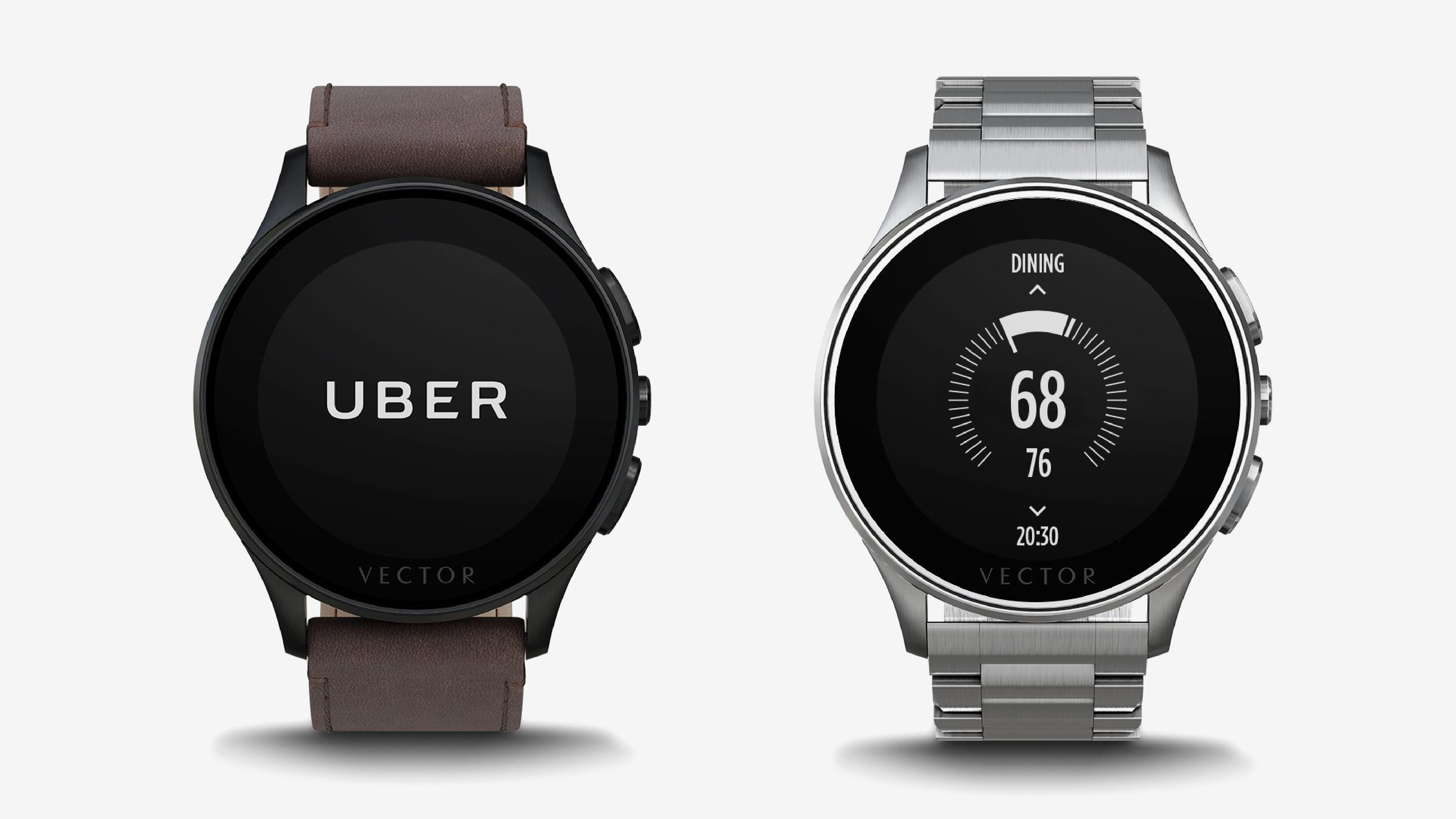
From designing watch faces and adding complications (functions like date, weather, distance walked) to integrated applications and notifications, Okapi collaborated with the Vector team to develop a straightforward interface with intuitive navigation gestures. We built a smart geometric grid to fit Vector’s proprietary lightweight OS on both their round and rectangular smartwatches (Luna and Meridian), custom fonts and icons, and a UI guide that allows room for growth.
We’re proud to have worked so closely with such an ambitious company. Happy to announce that the Vector Watch software platform and team joined Fitbit in January 2017.
Challenges
30 days battery life
Watch, not an iPod on your wrist
An open platform
How it works

In order to preserve 30 days of battery life, Vector watch is pairing with your mobile phone which it uses as the main system brain for the majority of required tasks. This doesn’t impose a significant battery consumption on the phone either as the application is heavily optimized, it also offers cross-platform compatibility with availability for Android, Windows Phone and iOS.
Gestures

The Grid
The challenge: Find the right grid for round smartwatches that designers can use to build watch faces and apps.


Colors
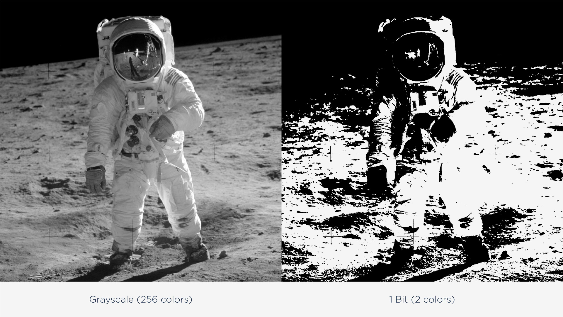
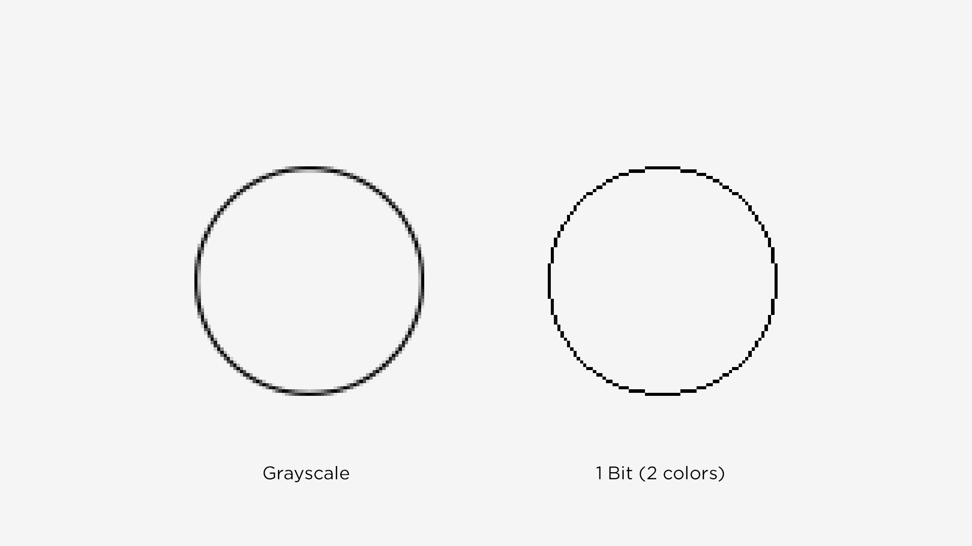
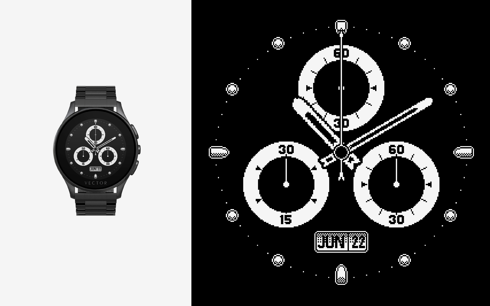
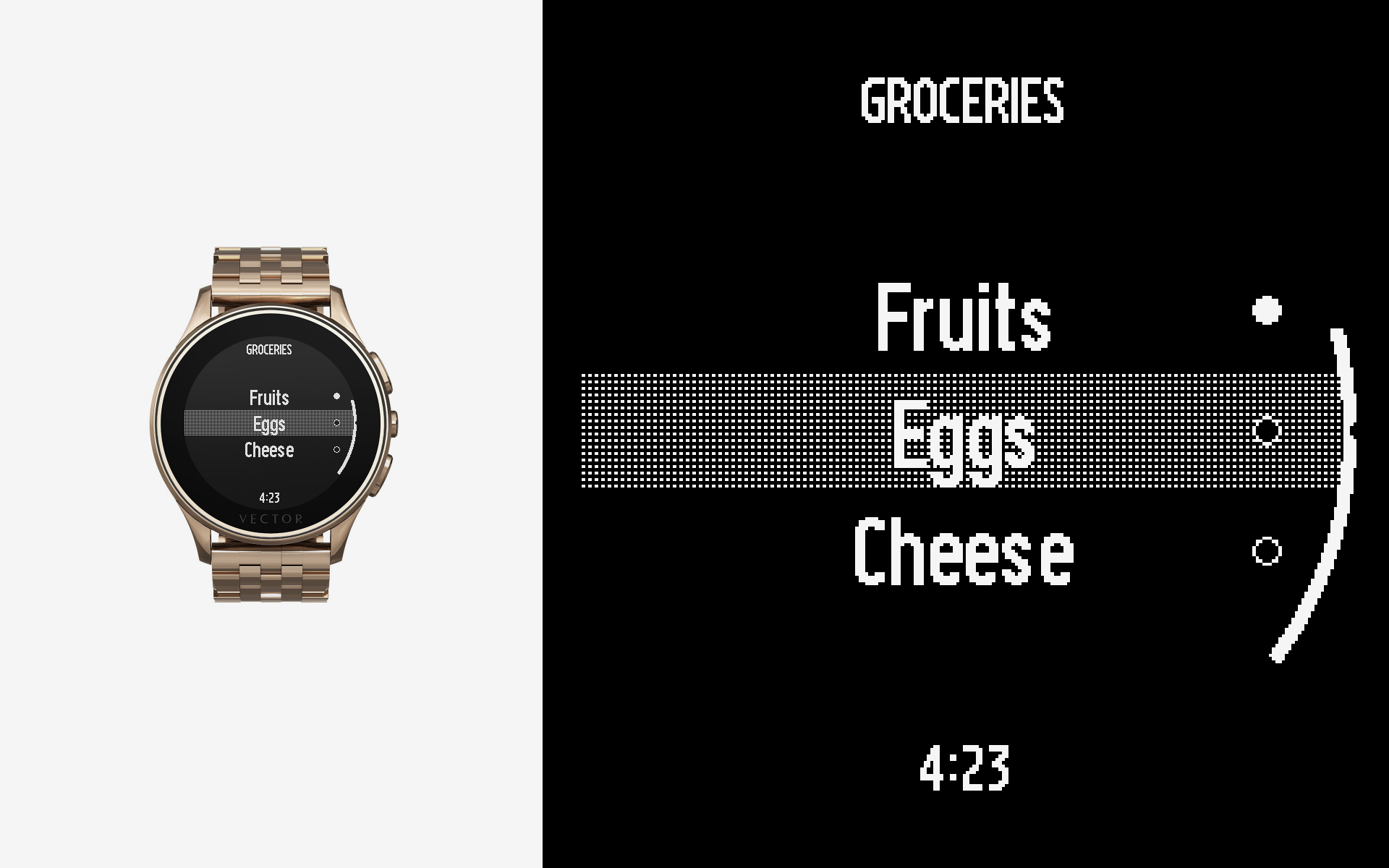
When thinking of black and white screens most people think of old tv sets that were actually greyscaled with 256 colors, on Vector Watch we literally had only 2 colors to work with. No shades of grey, no antialiasing, just blocky white pixels on a black background were the only thing we had in order to create the illusion that things are rounded.
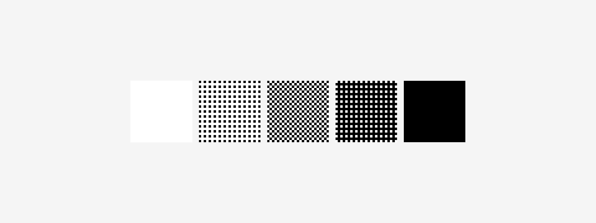
We were inspired by the halftone print technique, which uses various dot sizes in order to reproduce brightness, and while we could not change the pixel sizing, we could however make use of their density in order to obtain three additional grey tones. This technique helped us generate shadow effects, volumes and various other user interface elements.
Fonts
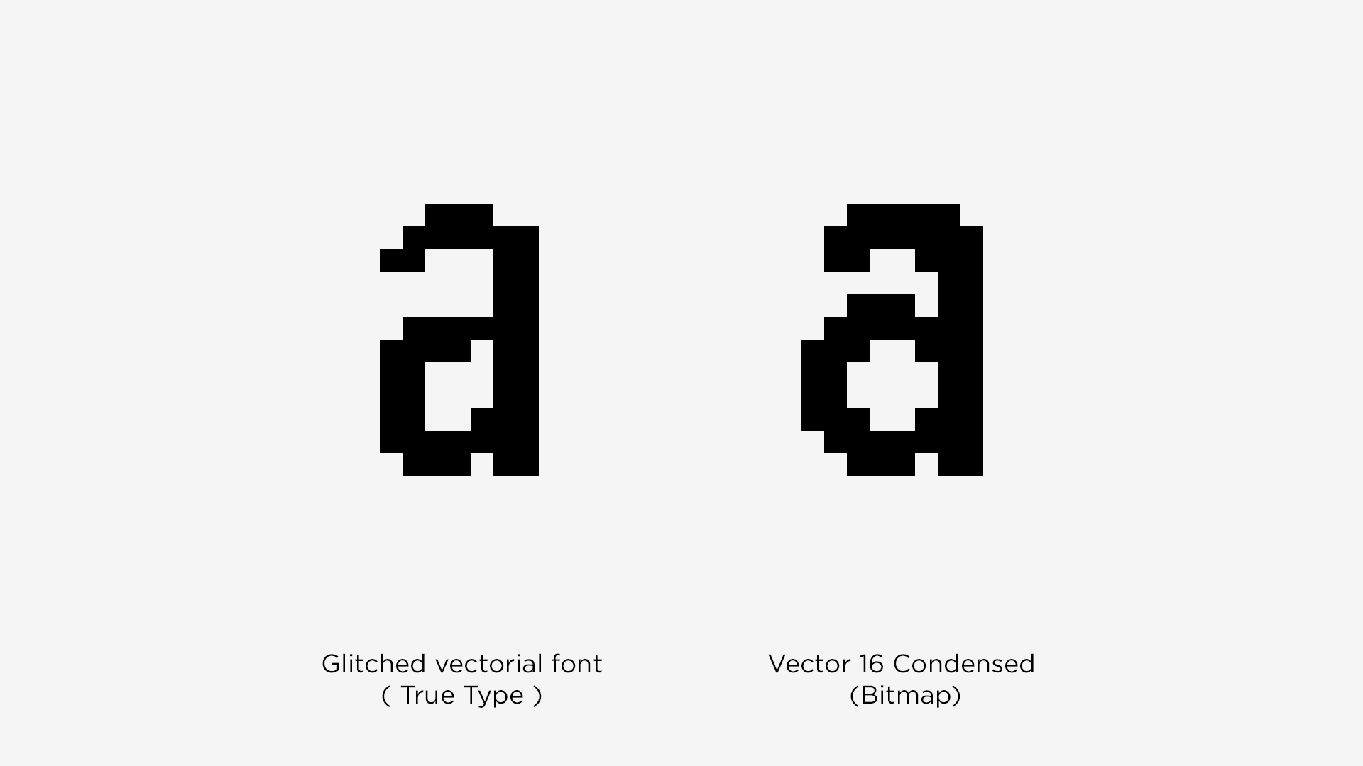
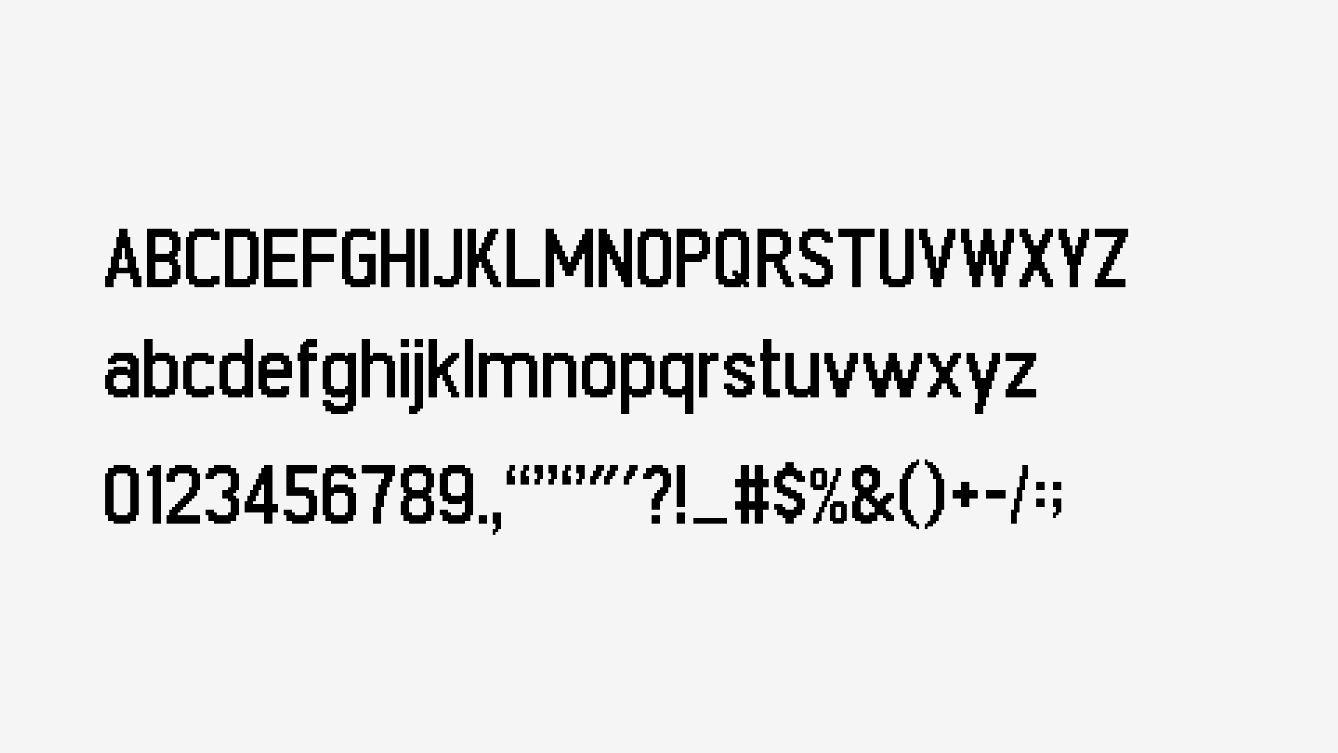
Starting with the '90s the vectorial fonts entered the computer industry. Their main advantage is that they scale up without any issues. However, on small resolutions, they start to look blurry or glitchy.
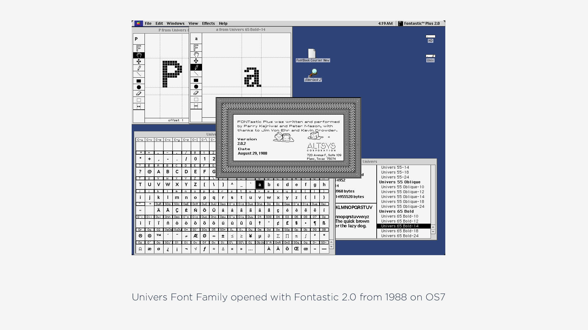
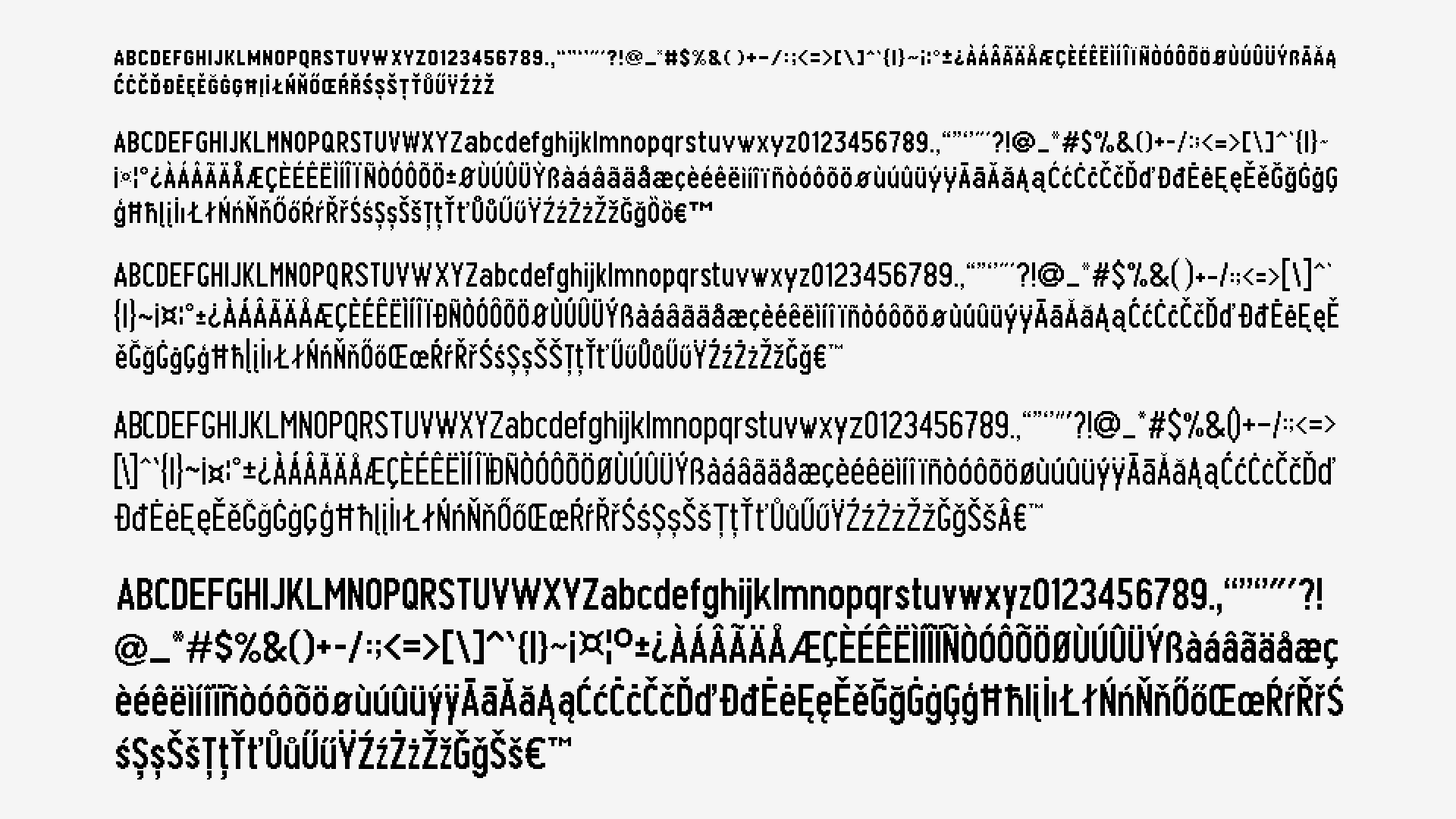
When it comes to colors or screen resolution, the Vector watch screen is more closely related to the '70s - '80s type of displays than modern ones. From the first tests it was clear that we will have problems going with vector fonts (TrueType) and so we’ve started to look for alternatives, ending up with research on how the bitmap fonts were used back in the day.
We’ve looked for old computer sets, we’ve installed emulators and we’ve found out that a few decades ago you had to create a separate font file for each font sizing you needed and the pixels were set manually one by one for each letter and each correspondent size version. So that’s what we ended doing.
We’ve defined the graphic style through a master font and then we’ve re-created the same style 5 more times pixel by pixel, letter by letter, in order to cover all font sizes that we’ve needed for the device. Each size is about 350 characters (extended Latin), which accommodates usage for any country/language in the world that utilizes the Latin alphabet.
Iconography
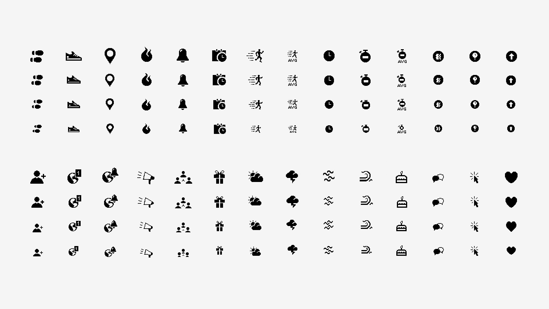
Since the watch had to support app integrations, the next step after creating the custom fonts was to design the accompanying icon set. Based on the grid and usability rules we ended up with 4 different sizes for each icon. The icons helped the standard app development process as wand at the same time they were offered to third-party developers that wanted to contribute with their own creations. We didn’t want to let other people add new graphic elements to the watch in this first version, primarily for interface consistency and at the same time utilizing the standard set also saved memory space in the system. Since the watch had to support app integrations, the next step after creating the custom fonts was to design the accompanying icon set. Based on the grid and usability rules we ended up with 4 different sizes for each icon. The icons helped the standard app development process as wand at the same time they were offered to third-party developers that wanted to contribute with their own creations. We didn’t want to let other people add new graphic elements to the watch in this first version, primarily for interface consistency and at the same time utilizing the standard set also saved memory space in the system.
Complications
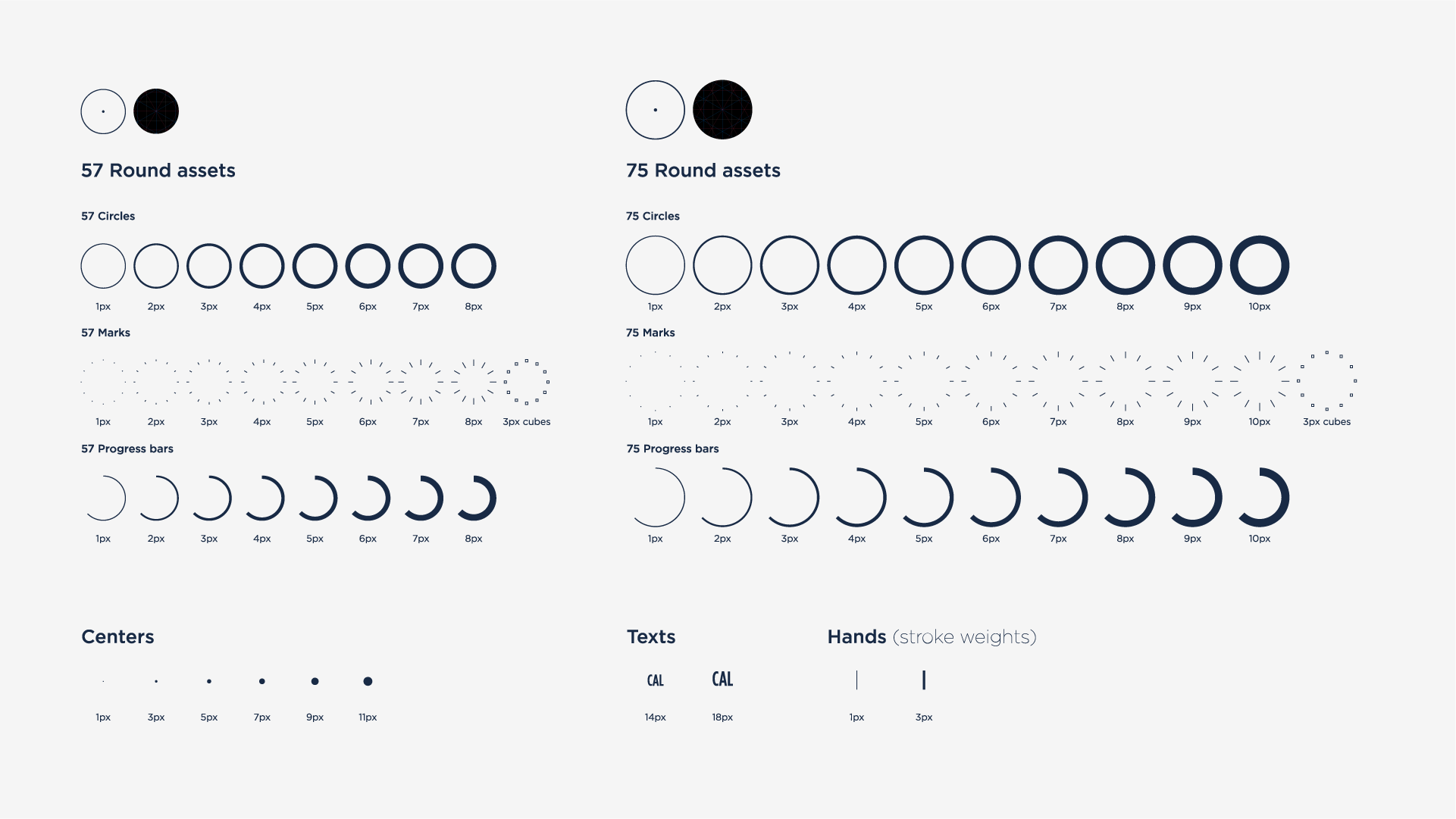
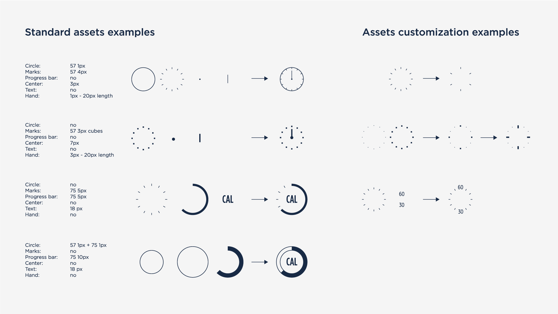
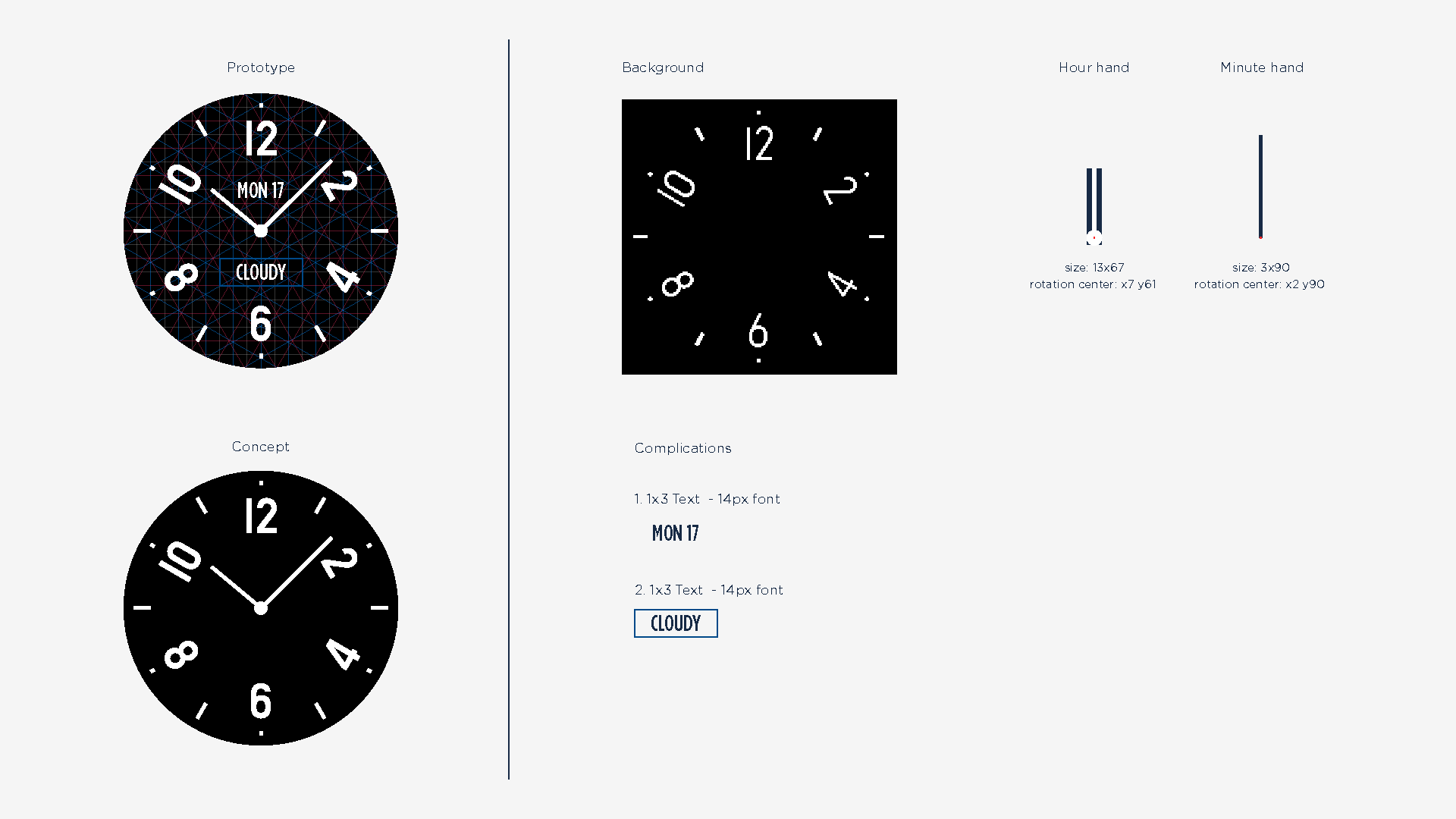
We’ve defined the required assets for building complications, such as dial modules, progress bars, text widgets and so on.

Faces
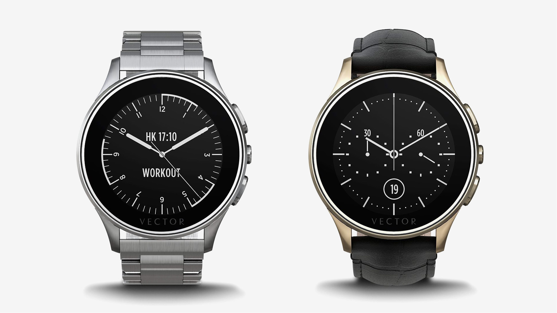
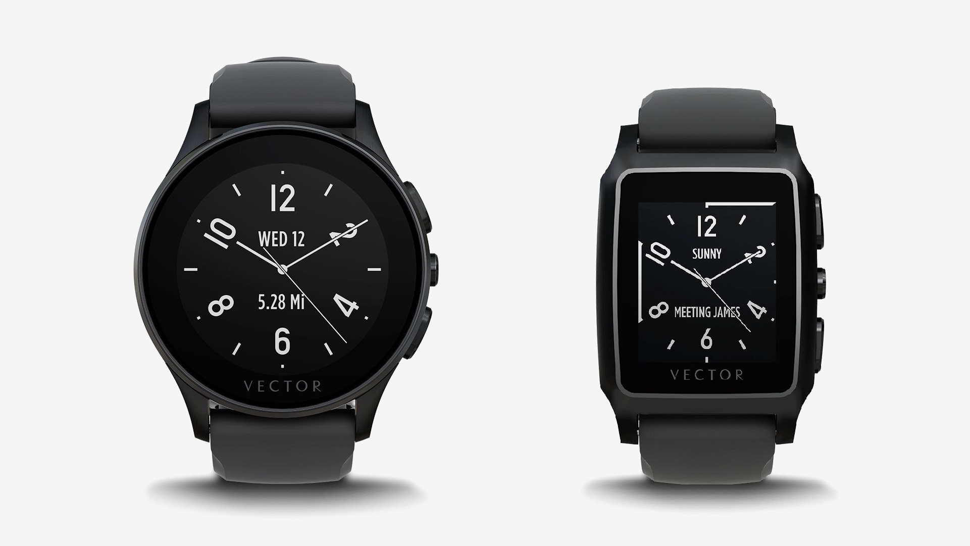
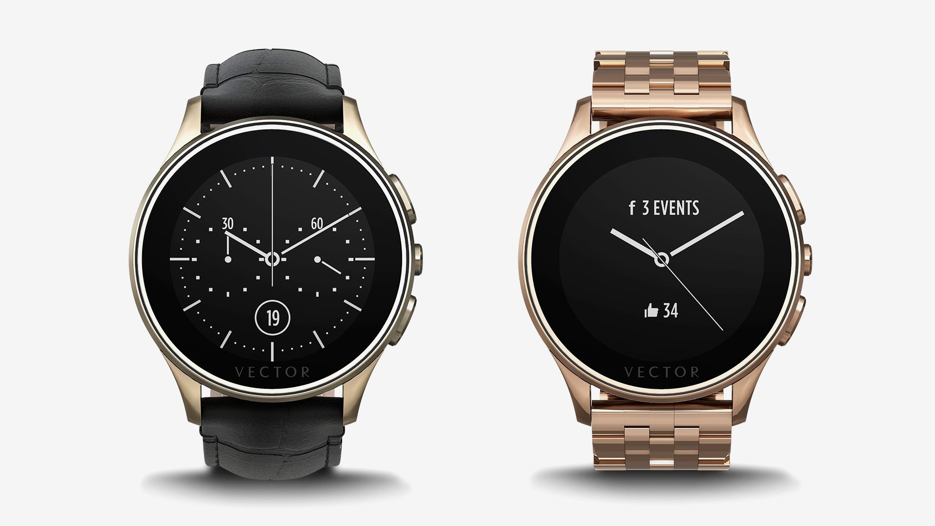
We have designed 12 default watch faces, and when the platform opened for developers then other designers started submitting their own creations too utilizing the graphic assets that we’ve prepared for them.
Apps
App integration is a key part of the watch functionality, and so we’ve designed interfaces for two types of applications, the standard ones such as timer, fitness, music, notifications and settings, as well as third-party apps like Uber, Nest and Evernote.
